Raklet engineering docs · Help Center draft
Digital Membership Cards: How They Work and How to Choose Fields
Digital membership cards let members carry a branded card with a scannable QR code on the web, Apple Wallet, or Google Wallet. This guide explains where admins configure the card, which data can appear in each slot, how barcode scanning behaves, and how layouts differ between the member portal and wallet apps.
What digital cards are
A digital membership card is a pass-style card tied to a member’s subscription. It can show the member’s name, membership number, plan details, and other fields you choose. Members can:
- View the card in the social network / member portal
- Download it as an image
- Add it to Apple Wallet or Google Wallet
- Scan the QR code for check-in, profile lookup, or contact identification (depending on your barcode setting)
Card layout is controlled at the organization level under Membership settings. The same field mapping applies to every plan unless a plan overrides colors.
Where to configure your card
- Sign in to the Admin Panel.
- Open Membership in the main navigation.
- Go to Settings → Digital Card.
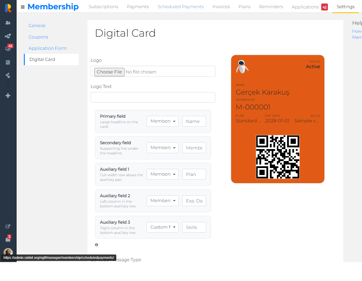
- Choose data fields, labels, barcode behavior, and colors. Use the live preview on the right.
- Click Save.
Direct path in the manager app:
Membership → Settings → Digital Card
The five configurable field slots
Each digital card has five slots. For every slot you pick a data field (what to show) and a display label (the small caption members see above the value).
| Slot | Role on the card | Typical use |
|---|---|---|
| Primary field | Large headline on the card | Member name |
| Secondary field | Supporting line under the headline | Member number |
| Auxiliary field 1 | Full-width row above the auxiliary pair | Plan name |
| Auxiliary field 2 | Left column in the bottom auxiliary row | Expiration / renewal date |
| Auxiliary field 3 | Right column in the bottom auxiliary row | Custom field, benefit, interval, or hidden |
Data field picker
Each slot has a searchable dropdown grouped by category, for example
Membership · Name or Custom fields · Skills.
Type in the box to filter fields quickly.
Display label
The display label is the caption shown on the card (for example Name, Member No, Plan). For built-in membership fields, Raklet suggests a default label when you change the data field. You can edit the label to match your organization’s wording or language needs.
For contact or custom fields, the field’s name from your account settings is used as the default label. You can still override it.
Hidden slots
Choose Options → Hidden in the data field dropdown to leave a slot empty. Hidden slots do not appear on the card and their display label is cleared automatically.
Built-in data you can display
These membership fields are available in every organization:
| Field | What members see | Notes |
|---|---|---|
| Name | Member’s full name | Best fit for the primary slot |
| Member No | Membership / member number | Often used in the secondary slot |
| Plan | Subscription plan name | |
| Exp. Date | Renewal or end date | Hidden automatically when there is no date (for example one-time or scheduled plans) |
| Status | Subscription status text | Also shown in the header by default |
| Benefit | Plan benefit text from the plan editor | Rich text is shown as plain text on wallet passes |
| Interval | Billing interval (for example Annual) | |
| Start Date | Subscription start date | |
| End Date | Subscription end date | |
| Hidden | Nothing | Removes the slot from the card |
Contact and custom fields
Beyond built-in membership fields, you can map organization attributes to any slot:
- Custom fields you created under Settings → Fields
- Profile attributes (title, gender, blood type, and similar)
- Contact fields (email, phone)
- Address fields
- Work & education fields
Some internal or duplicate fields are intentionally excluded from the picker (for example balance, tags, or fields already represented by built-in options). Manage available custom fields from Settings → Fields; a link is provided on the Digital Card page.
Default layout for new organizations
When an organization has not saved Digital Card settings yet, Raklet uses these defaults:
| Slot | Data field | Display label |
|---|---|---|
| Primary | Name | Name |
| Secondary | Member No | Member No |
| Auxiliary 1 | Plan | Plan |
| Auxiliary 2 | Exp. Date | Exp. Date |
| Auxiliary 3 | Hidden | — |
Default colors are derived from your organization brand color when available (background + contrasting text). Default logo uses your organization logo.
Barcode / QR code behavior
Digital cards use a QR code (format PKBarcodeFormatQR). What happens when
someone scans the code depends on Barcode Message Type:
| Setting | When scanned | Typical use case |
|---|---|---|
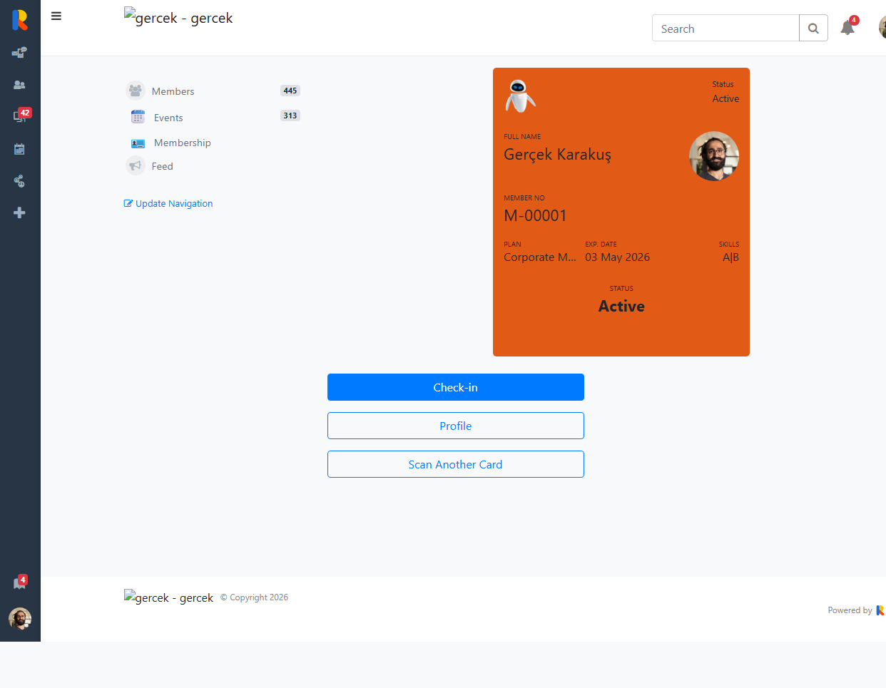
| Launch Check-in (default) | Opens the member’s card page with check-in mode (?checkin=true). Staff or the member can tap Check-in. |
Events, front desk, membership verification with one-tap check-in |
| Launch Profile on Admin Panel | Opens the member’s contact profile in the admin Contacts area (manager must be signed in). | Staff quickly looking up a member after scanning |
| Return Contact Id | Encodes the member number / contact id string only (no URL). | Integrations or external scanners that read raw IDs |
Logo and colors
- Logo — Upload a PNG/JPEG. If empty, the organization logo is used on member-facing cards.
- Logo text — Short text beside the logo (often your organization short name).
- Background color — Card fill color (RGB).
- Text color — Labels and values. Pick a color with enough contrast against the background.
The admin preview updates as you edit colors and fields. Always click Save before testing on a real member card.
What members see
Members open their card from the social network / member portal (for example from Membership or their subscription detail). The card shows:
- Your logo and logo text
- Status in the header
- Profile photo (when available)
- The five configured fields (minus hidden slots)
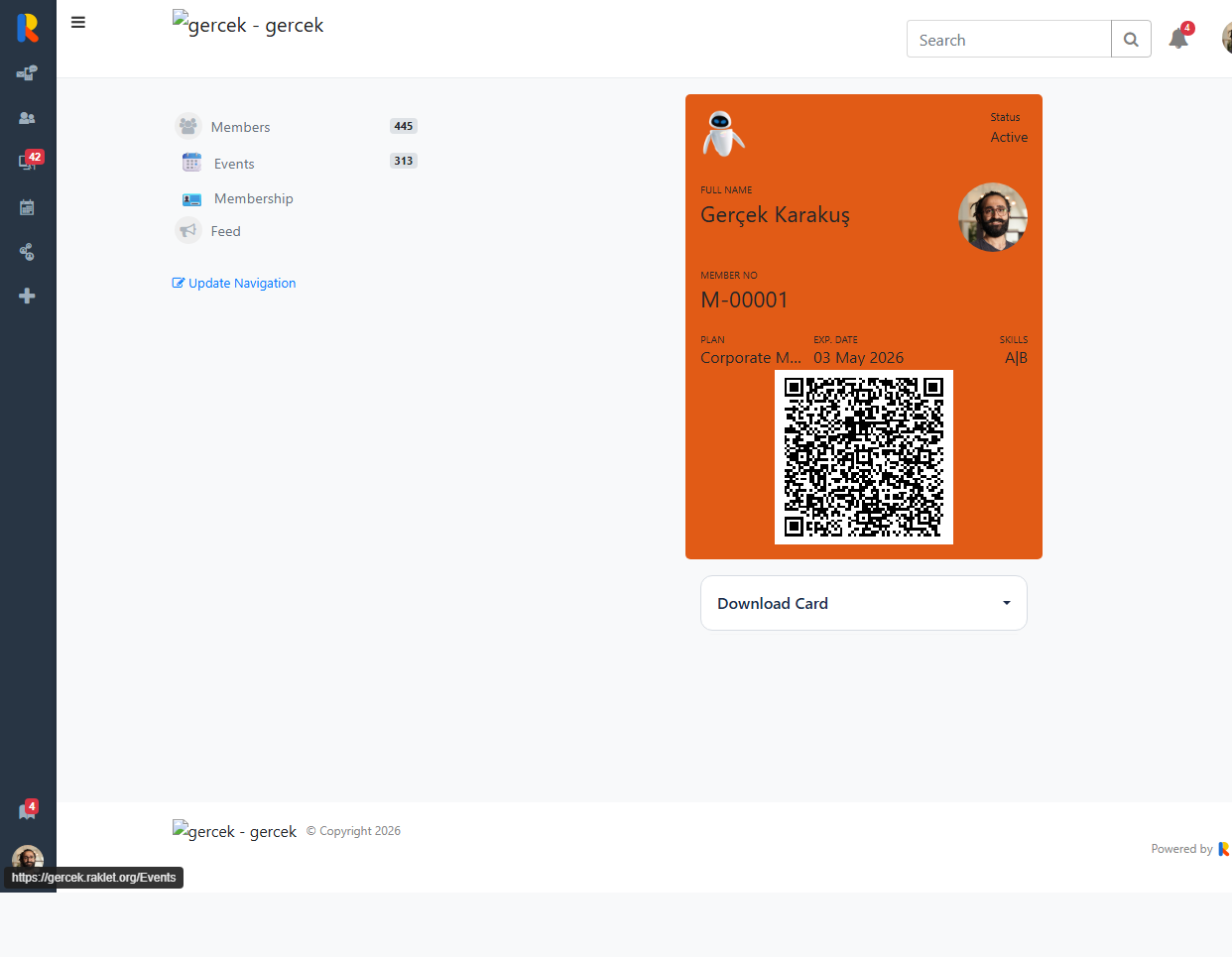
- A QR code at the bottom (except in check-in mode)
Below the card, members can use Download Card to:
- Add to Apple Wallet
- Add to Google Wallet
- Download as image
Apple Wallet: front vs. back of the pass
Apple Wallet uses a generic pass layout. Because the member photo appears as a thumbnail on the front, Apple may hide some auxiliary rows on the front even though they are configured. Raklet maps fields as follows:
Front of pass
- Header — Subscription status
- Primary — Primary slot (usually name)
- Thumbnail — Member photo when available
- Secondary — First two detail slots after primary (typically Member No + Plan)
- Auxiliary row — Next detail slots when Apple has room (often Exp. Date and a third field)
Back of pass (info / “more” section)
When members flip the pass or tap the info button, they see all configured slots (primary, secondary, and all three auxiliary fields) listed with labels and values. Fields that do not fit on the front still appear here.
Plan benefits on wallet passes
Plan benefits are edited per plan (in the plan’s Benefits section). You have two ways to show them on cards:
-
Assign Benefit to a slot — Choose
Membership · Benefitin any of the five field slots. It appears wherever that slot is rendered (web, wallet front/back depending on layout). - Automatic on Apple Wallet back — If the plan has benefit text and you did not already place Benefit in a slot, Raklet adds a Benefit row on the back of the Apple Wallet pass. HTML formatting is stripped to plain text for wallet display.
Can benefits coexist with other auxiliary fields on the back? Yes. Configured auxiliary fields (for example Exp. Date and Skills) appear on the back together with the automatic Benefit row. Duplicate Benefit rows are avoided when Benefit is already mapped to a slot.
Google Wallet
Google Wallet passes use the same underlying field mapping. Layout rules differ slightly from Apple, but configured slots and barcode behavior are shared.
Per-plan color overrides
In Membership → Plans → [Plan] → Edit, each plan can inherit digital card colors from organization Digital Card settings (default) or define its own background and text colors. Field selection remains organization-wide; only colors can differ per plan when inheritance is turned off.
FAQ
Why doesn’t my custom field appear in the picker?
Some system fields are excluded because they duplicate built-in options or are not suitable for display on a wallet pass. Create or edit custom fields under Settings → Fields, then return to Digital Card settings and search for the field name.
Can I use the same field in two slots?
The admin UI does not block duplicate selections, but showing the same value twice is usually confusing. Prefer unique slots or hide unused slots.
Why is Exp. Date missing for some members?
Expiration date is computed from renewal date, end date, and plan interval. One-time plans, scheduled subscriptions, or memberships without a date may leave this field empty — and the slot is hidden on the member card when empty.
Do changes apply to cards already in Apple Wallet?
Wallet passes can be updated when members refresh or re-download the pass. Field and color changes take effect on newly generated passes after you save Digital Card settings.
Where is the old Code 128 barcode option?
New and updated organizations use QR codes only. Saving Digital Card settings sets the format to QR automatically.
Related articles
- How to Create Digital Membership Cards?
- Digital Membership Card QR Code Options (update recommended — fold barcode section into this article)