Donation / fundraising detail page — redesign
Status: direction C implemented, in review · Epic: ENG-87 (Fundraising) ·
Surface: member-facing detail page ({org}.raklet.com/donations/details/{id}) ·
Discussion: #14039 ·
Implementation: #14056 ·
Date: 2026-06-15
The public page a supporter lands on from a fundraising campaign link. Organizers supply their own title, description, and image; the page renders those plus live fundraising stats (raised / goal / backers / days left) and the support flow.
Why redesign
The current page is dated and works against the organizer:
- Two competing "Support" CTAs — a top button and the amount-tier card — with no hierarchy. The user has to think about which one to use.
- The progress card is the most important element on a fundraising page (it is the trust-and-momentum signal) but it is visually plain and easy to skim past.
- Social proof is buried in a "Backers" tab. Fundraising runs on social proof; it should be visible.
- Generic, flat typography — the organizer's title deserves real display hierarchy.
- No graceful handling of long or repetitive copy. Organizer-written descriptions can be long and repetitive; today they fill the whole column and flatten the page.
What every direction fixes
- One clear support CTA (removes the duplicate top button + tier card).
- Progress / goal becomes the visual anchor.
- Backers surfaced as social proof, not hidden in a tab.
- Story constrained to a comfortable reading column with a "read more" clamp, so long or repetitive copy can't wreck the layout.
- A consistent frame for the organizer's uploaded image.
All three are built on the member portal design system:
per-org --portal-accent (shown here in this org's orange, themeable per org),
soft bordered cards, 44px touch targets.
The three directions
▶ Interactive side-by-side board (click any mockup to open full size)
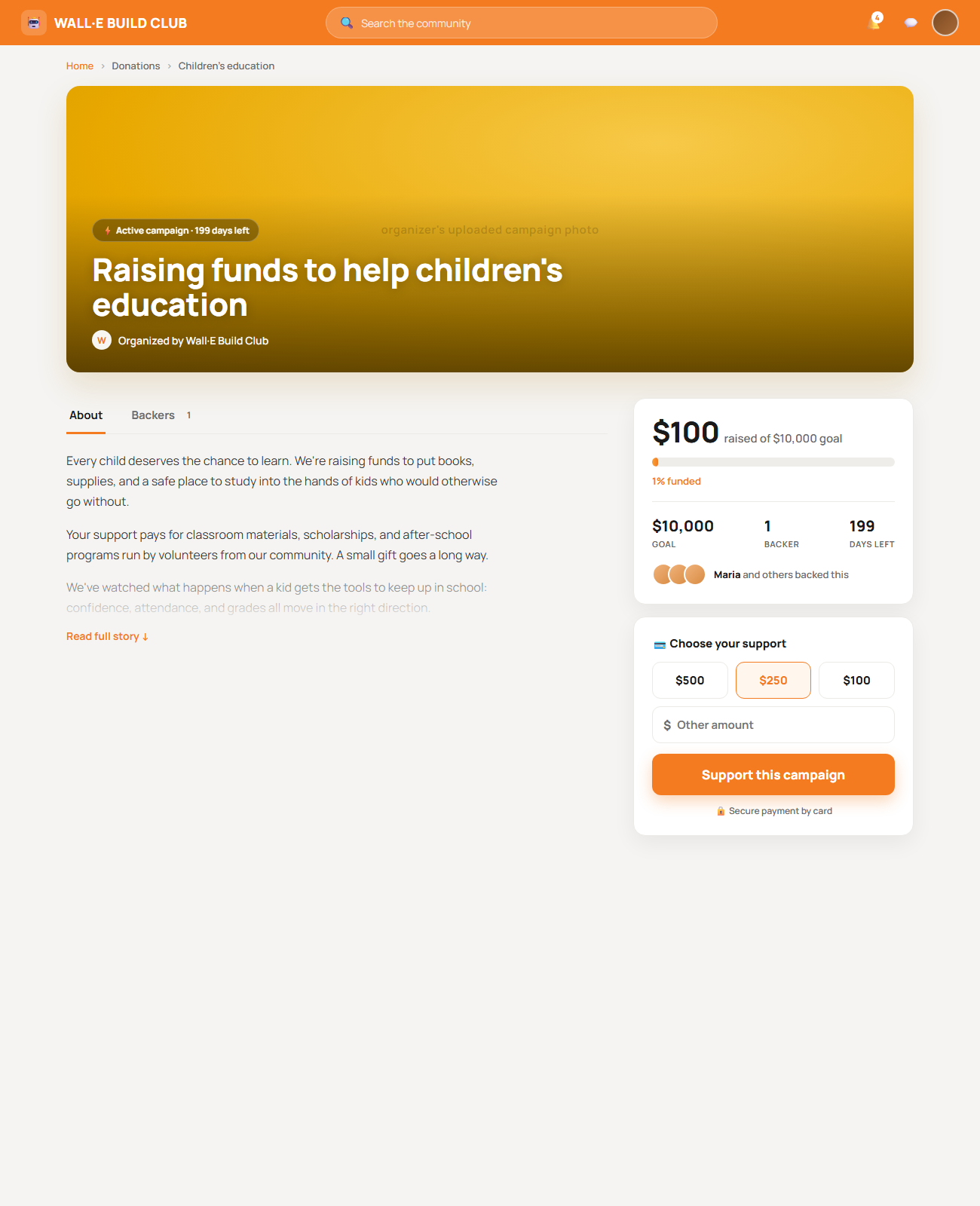
A — Momentum (crowdfunding energy)
Full-bleed hero with the title overlaid; a bold sticky donation rail with backer avatars is the hero of the page. Most emotional first impression and the strongest "give now" pull; the biggest departure from our calm system, and the busiest of the three.
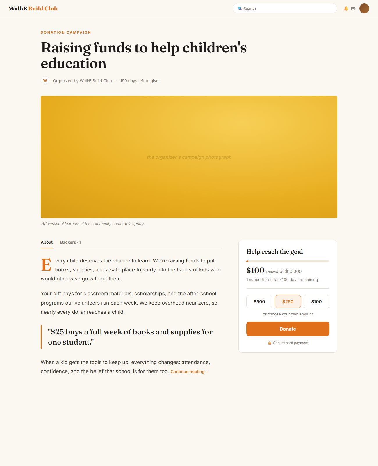
B — Story-first / Editorial
Reads like a magazine feature: a serif display headline, a generous reading column, an impact pull-quote ("$25 = a week of books"), and a calm donation sidebar. Premium and human; the donation card is quieter, so a softer conversion pull, and the serif may not suit every org.
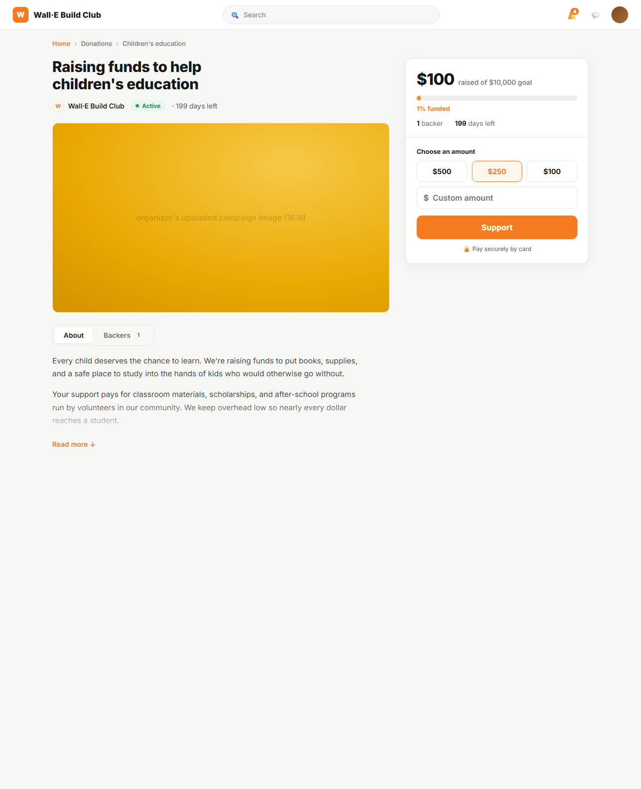
C — Focused Conversion Card (recommended base)
Closest to our approved Calm Community system. One unified donation card merges progress + amount + CTA; segmented tabs; clamped story. Cleanest and lowest implementation risk; least emotional, so it leans on the organizer's image to carry feeling.
Recommendation
Ship C as the base (system-consistent, low risk) and graft on A's prominent progress bar and backer avatars so it isn't emotionally flat. Go B only if we decide donation pages should lean editorial / narrative org-wide.
The mockups are hand-built HTML/CSS, so the chosen direction doubles as the
implementation reference for the Razor view + social/*.scss. Screenshots are on
rakletlocalfiles blob storage, not committed to the repo.
Implementation: direction C is built in #14056
(Application/Areas/Donations/Views/Home/Details.cshtml +
social/pages/social-campaigns.scss): unified sticky donation card, framed 16:9
cover, segmented tabs, CSS-only story clamp, backer-avatar social proof, and the
duplicate top CTA removed. No new resource strings; accent stays --portal-accent.
Open question for the team
Do we want one donation-page style across all orgs (C/A), or should the template lean editorial (B) for cause/nonprofit orgs? That decision sets whether the page is one component or a themeable layout choice.